Learning Objectives
Upon completion of this chapter, readers will demonstrate proficiency in implementing simple linear regression using Python by:
2.1 Implementing OLS estimation procedures using NumPy array operations to compute slope and intercept parameters from data matrices.
2.2 Applying statsmodels formula API to estimate regression models and extract fitted values, residuals, and diagnostic statistics.
2.3 Computing and interpreting goodness-of-fit measures including R-squared and standard error of regression using Python statistical libraries.
2.4 Evaluating regression assumptions through residual analysis and diagnostic plots generated with matplotlib and seaborn.
2.5 Implementing robust standard error calculations to address heteroskedasticity using statsmodels covariance estimators.
2.6 Analyzing regression results with binary explanatory variables and interpreting coefficients as group mean differences.
2.7 Conducting hypothesis tests and constructing confidence intervals using scipy.stats distributions and statsmodels inference methods.
2.8 Visualizing regression relationships through scatter plots with fitted lines and confidence bands using matplotlib.
The Simple Linear Regression model provides a cornerstone for econometric and statistical analysis, establishing foundational methods for understanding relationships between two variables. This chapter explores the mechanics of Ordinary Least Squares (OLS) regression, develops intuition for interpreting results, and examines the crucial assumptions that underpin validity of inference.
The presentation follows a hierarchical development from basic concepts to advanced applications. We demonstrate theoretical results using real-world datasets from the Wooldridge package, illustrating how abstract econometric principles manifest in practical examples. The chapter proceeds through derivation of OLS estimators (Section 2.1-2.2), analysis of their statistical properties (Section 2.3-2.4), and examination of units of measurement and functional forms (Section 2.5). We conclude with expected values, variance decomposition, and an introduction to causal inference through randomized experiments (Section 2.6-2.9).
Throughout this chapter, we implement concepts using Python’s scientific computing stack, building intuition through numerical examples and visualization.
# Import required libraries
import matplotlib.pyplot as plt
import numpy as np
import pandas as pd
import seaborn as sns
import statsmodels.formula.api as smf
import wooldridge as wool
from IPython.display import display
from scipy import stats

# Set plotting style for enhanced visualizations
sns.set_style("whitegrid")  # Clean seaborn style with grid
sns.set_palette("husl")  # Attractive color palette
plt.rcParams["figure.figsize"] = [10, 6]  # Default figure size
plt.rcParams["font.size"] = 11  # Slightly larger font size
plt.rcParams["axes.titlesize"] = 14  # Larger title font
plt.rcParams["axes.labelsize"] = 12  # Larger axis label font
2.1 Simple OLS Regression
The Simple Linear Regression model aims to explain the variation in a dependent variable, , using a single independent variable, . It assumes a linear relationship between and the expected value of . The model is mathematically represented as:
Let’s break down each component:
(Dependent Variable): This is the variable we are trying to explain or predict. It’s often called the explained variable, regressand, or outcome variable.
(Independent Variable): This variable is used to explain the variations in . It’s also known as the explanatory variable, regressor, or control variable.
(Intercept): This is the value of when is zero. It’s the point where the regression line crosses the y-axis.
(Slope Coefficient): This represents the change in for a one-unit increase in . It quantifies the effect of on .
(Error Term): Also known as the disturbance term, it represents all other factors, besides , that affect . It captures the unexplained variation in . We assume that the error term has an expected value of zero conditional on : , which implies and that is uncorrelated with .
Our goal in OLS regression is to estimate the unknown parameters and . The Ordinary Least Squares (OLS) method achieves this by minimizing the sum of the squared residuals. The OLS estimators for and are given by the following formulas:
This formula shows that is the ratio of the sample covariance between and to the sample variance of . It essentially captures the linear association between and . The hat notation ( and ) emphasizes these are sample estimates of the population covariance and variance.
Once we have , we can easily calculate using this formula. It ensures that the regression line passes through the sample mean point .
After estimating and , we can compute the fitted values, which are the predicted values of for each observation based on our regression model:
These fitted values represent the points on the regression line.
Let’s put these formulas into practice with some real-world examples.
Example 2.3: CEO Salary and Return on Equity
In this example, we investigate the relationship between CEO salaries and the return on equity (ROE) of their firms. We want to see if firms with better performance (higher ROE) tend to pay their CEOs more. Our simple regression model is:
Here, salary is the dependent variable (CEO’s annual salary in thousands of dollars), and roe is the independent variable (return on equity, in percentage). We hypothesize that , meaning that a higher ROE is associated with a higher CEO salary. Let’s calculate the OLS coefficients manually first to understand the underlying computations.
# Load and prepare data
ceosal1 = wool.data("ceosal1")  # Load the ceosal1 dataset from wooldridge package
roe_values = ceosal1[
    "roe"
]  # Extract 'roe' (return on equity, %) as independent variable
salary_values = ceosal1["salary"]  # Extract 'salary' (in $1000s) as dependent variable

# Calculate OLS coefficients manually using the formula:
# beta_hat_1 = Cov(x,y) / Var(x) and beta_hat_0 = y_bar - beta_hat_1x_bar

# Step 1: Calculate sample statistics
covariance_roe_salary = np.cov(roe_values, salary_values)[1, 0]  # Sample covariance
variance_roe = np.var(roe_values, ddof=1)  # Sample variance (n-1 denominator)
mean_roe = np.mean(roe_values)  # Sample mean of ROE
mean_salary = np.mean(salary_values)  # Sample mean of salary

# Step 2: Apply OLS formulas
slope_estimate = covariance_roe_salary / variance_roe  # beta_hat_1 = Cov(x,y)/Var(x)
intercept_estimate = mean_salary - slope_estimate * mean_roe  # beta_hat_0 = y_bar - beta_hat_1x_bar

# Display results with clear formatting
manual_results = pd.DataFrame(
    {
        "Parameter": ["Intercept ($\\hat{\\beta}_0$)", "Slope ($\\hat{\\beta}_1$)"],
        "Estimate": [intercept_estimate, slope_estimate],
        "Formatted": [f"{intercept_estimate:.2f}", f"{slope_estimate:.2f}"],
        "Interpretation": [
            "Expected salary when ROE=0",
            "Salary increase per 1% ROE increase",
        ],
    },
)
# Display calculation details
calc_details = pd.DataFrame(
    {
        "Calculation": [
            "Sample covariance",
            "Sample variance of ROE",
            "Slope calculation",
        ],
        "Value": [
            f"{covariance_roe_salary:.2f}",
            f"{variance_roe:.2f}",
            f"{covariance_roe_salary:.2f} / {variance_roe:.2f} = {slope_estimate:.2f}",
        ],
    },
)

display(calc_details)
manual_results[["Parameter", "Formatted", "Interpretation"]]The code first loads the ceosal1 dataset and extracts the ‘roe’ and ‘salary’ columns as our and variables, respectively. Then, it calculates the covariance between roe and salary, the variance of roe, and the means of both variables. Finally, it applies the formulas to compute and and displays them.
Now, let’s use the statsmodels library, which provides a more convenient and comprehensive way to perform OLS regression. This will also serve as a verification of our manual calculations.
# Fit regression model using statsmodels for comparison and validation
regression_model = smf.ols(
    formula="salary ~ roe",  # y ~ x notation: salary depends on roe
    data=ceosal1,
)
fitted_results = regression_model.fit()  # Estimate parameters via OLS
coefficient_estimates = fitted_results.params  # Extract beta_hat estimates

# Display statsmodels results with additional statistics
statsmodels_results = pd.DataFrame(
    {
        "Parameter": ["Intercept ($\\hat{\\beta}_0$)", "Slope ($\\hat{\\beta}_1$)"],
        "Estimate": [coefficient_estimates.iloc[0], coefficient_estimates.iloc[1]],
        "Std Error": [fitted_results.bse.iloc[0], fitted_results.bse.iloc[1]],
        "t-statistic": [fitted_results.tvalues.iloc[0], fitted_results.tvalues.iloc[1]],
        "p-value": [fitted_results.pvalues.iloc[0], fitted_results.pvalues.iloc[1]],
    },
)

# Verify manual calculations match statsmodels
model_stats = pd.DataFrame(
    {
        "Metric": ["R-squared", "Number of observations"],
        "Value": [f"{fitted_results.rsquared:.4f}", f"{fitted_results.nobs:.0f}"],
    },
)

display(model_stats)
statsmodels_results.round(4)This code snippet uses statsmodels.formula.api to define and fit the same regression model. The smf.ols function takes a formula string ("salary ~ roe") specifying the model and the dataframe (ceosal1) as input. results.fit() performs the OLS estimation, and results.params extracts the estimated coefficients. We can see that the coefficients obtained from statsmodels match our manual calculations, which is reassuring.
To better visualize the regression results and the relationship between CEO salary and ROE, let’s create an enhanced regression plot. We’ll define a reusable function for this purpose, which includes the regression line, scatter plot of the data, confidence intervals, and annotations for the regression equation and R-squared.
def plot_regression(
    x: str,
    y: str,
    data: pd.DataFrame,
    results,
    title: str,
    add_ci: bool = True,
):
    """Create an enhanced regression plot with confidence intervals and statistics.

    Parameters
    ----------
    x : str
        Column name of independent variable in data
    y : str
        Column name of dependent variable in data
    data : pandas.DataFrame
        Dataset containing both variables
    results : statsmodels.regression.linear_model.RegressionResults
        Fitted OLS regression results object
    title : str
        Main title for the plot
    add_ci : bool, default=True
        Whether to display 95% confidence interval band

    Returns
    -------
    matplotlib.figure.Figure
        The created figure object

    """
    # Create figure with professional styling
    fig, ax = plt.subplots(figsize=(12, 8))

    # Plot data points and regression line with confidence band
    sns.regplot(
        data=data,
        x=x,
        y=y,
        ci=95 if add_ci else None,  # 95% confidence interval for mean prediction
        ax=ax,
        scatter_kws={"alpha": 0.6, "edgecolor": "white", "linewidths": 0.5},
        line_kws={"linewidth": 2},
    )

    # Construct regression equation and statistics text
    intercept = results.params.iloc[0]
    slope = results.params.iloc[1]
    equation = f"$\\hat{{y}}$ = {intercept:.2f} + {slope:.2f}x"
    r_squared = f"$R^2$ = {results.rsquared:.3f}"
    n_obs = f"n = {int(results.nobs)}"

    # Add formatted text box with regression statistics
    textstr = f"{equation}\n{r_squared}\n{n_obs}"
    ax.text(
        0.05,
        0.95,
        textstr,
        transform=ax.transAxes,
        verticalalignment="top",
        bbox=dict(boxstyle="round", facecolor="white", alpha=0.8),
    )

    # Clean title and labels
    ax.set_title(title)
    ax.set_xlabel(x.replace("_", " ").title())
    ax.set_ylabel(y.replace("_", " ").title())

    plt.tight_layout()
This function, plot_regression, takes the variable names, data, regression results, and plot title as input. It generates a scatter plot of the data points, plots the regression line, and optionally adds 95% confidence intervals around the regression line. It also annotates the plot with the regression equation and the R-squared value. This function makes it easy to visualize and interpret simple regression results.
# Create enhanced regression plot for CEO Salary vs ROE
plot_regression(
    "roe",
    "salary",
    ceosal1,
    fitted_results,
    "CEO Salary vs Return on Equity",
)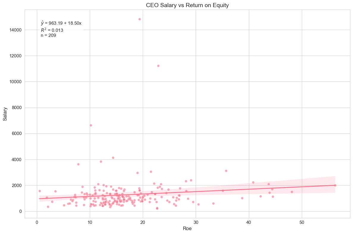
Running this code will generate a scatter plot with ‘roe’ on the x-axis and ‘salary’ on the y-axis, along with the OLS regression line and its 95% confidence interval. The plot also displays the estimated regression equation and the R-squared value.
Interpretation of Example 2.3
Looking at the output and the plot, we can interpret the results. The estimated regression equation (visible on the plot) will be something like:
We find . This means that, on average, for every one percentage point increase in ROE, CEO salary is predicted to increase by approximately $18,500 (since salary is in thousands of dollars). The intercept, , represents the predicted salary when ROE is zero. The R-squared value (also on the plot) is 0.013, indicating that only about 1.3% of the variation in CEO salaries is explained by ROE in this simple linear model. This suggests that ROE alone is not a strong predictor of CEO salary, and other factors are likely more important.
Example 2.4: Wage and Education
Let’s consider another example, examining the relationship between hourly wages and years of education. We use the wage1 dataset and the following model:
Here, wage is the hourly wage (in dollars), and educ is years of education. We expect a positive relationship, i.e., , as more education is generally believed to lead to higher wages.
# Load and analyze wage data
wage1 = wool.data("wage1")  # Load the wage1 dataset

# Fit regression model
reg = smf.ols(formula="wage ~ educ", data=wage1)  # Define and fit the OLS model
results = reg.fit()  # Fit the model

# Display regression results using DataFrame
wage_results = pd.DataFrame(
    {
        "Parameter": [
            "Intercept ($\\beta_0$)",
            "Education coefficient ($\\beta_1$)",
            "R-squared",
        ],
        "Value": [results.params.iloc[0], results.params.iloc[1], results.rsquared],
        "Formatted": [
            f"{results.params.iloc[0]:.2f}",
            f"{results.params.iloc[1]:.2f}",
            f"{results.rsquared:.3f}",
        ],
    },
)
wage_results[["Parameter", "Formatted"]]This code loads the wage1 dataset, fits the regression model of wage on educ using statsmodels, and then shows the estimated coefficients and R-squared.
Interpretation of Example 2.4
We find . This implies that, on average, each additional year of education is associated with an increase in hourly wage of approximately $0.54. The intercept, , represents the predicted wage for someone with zero years of education. The R-squared is 0.165, meaning that about 16.5% of the variation in hourly wages is explained by years of education in this simple model. Education appears to be a somewhat more important factor in explaining wages than ROE was for CEO salaries, but still, a large portion of wage variation remains unexplained by education alone.
# Create visualization
plot_regression(
    "educ",
    "wage",
    wage1,
    results,
    "Wage vs Years of Education",
)  # Generate regression plot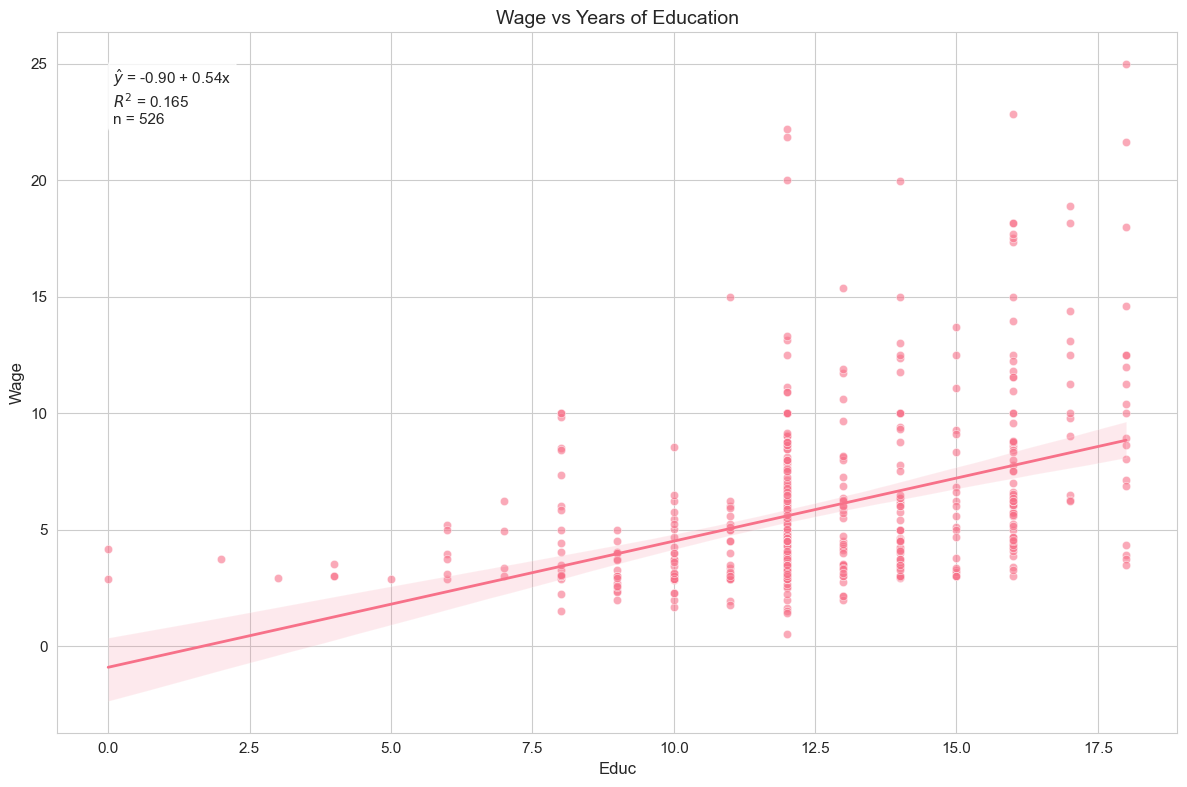
The regression plot visualizes the relationship between years of education and hourly wage, showing the fitted regression line along with the data points and confidence interval.
Example 2.5: Voting Outcomes and Campaign Expenditures
In this example, we explore the relationship between campaign spending and voting outcomes. We use the vote1 dataset and the model:
Here, voteA is the percentage of votes received by candidate A, and shareA is the percentage of campaign spending by candidate A out of the total spending by both candidates. We expect that higher campaign spending share for candidate A will lead to a higher vote share, so we anticipate .
# Load and analyze voting data
vote1 = wool.data("vote1")  # Load the vote1 dataset

# Fit regression model
reg = smf.ols(formula="voteA ~ shareA", data=vote1)  # Define and fit the OLS model
results = reg.fit()  # Fit the model

# Display regression results using DataFrame
vote_results = pd.DataFrame(
    {
        "Parameter": [
            "Intercept ($\\beta_0$)",
            "Share coefficient ($\\beta_1$)",
            "R-squared",
        ],
        "Value": [results.params.iloc[0], results.params.iloc[1], results.rsquared],
        "Formatted": [
            f"{results.params.iloc[0]:.2f}",
            f"{results.params.iloc[1]:.2f}",
            f"{results.rsquared:.3f}",
        ],
    },
)
vote_results[["Parameter", "Formatted"]]This code loads the vote1 dataset, fits the regression model using statsmodels, and shows the estimated coefficients and R-squared.
Interpretation of Example 2.5
We find . This suggests that for every one percentage point increase in candidate A’s share of campaign spending, candidate A’s vote share is predicted to increase by approximately 0.46 percentage points. The intercept, , represents the predicted vote share for candidate A if their campaign spending share is zero. The R-squared is 0.856, which is quite high! It indicates that about 85.6% of the variation in candidate A’s vote share is explained by their share of campaign spending in this simple model. This suggests that campaign spending share is a very strong predictor of voting outcomes, at least in this dataset.
# Create visualization
plot_regression(
    "shareA",
    "voteA",
    vote1,
    results,
    "Vote Share vs Campaign Spending Share",
)  # Generate regression plot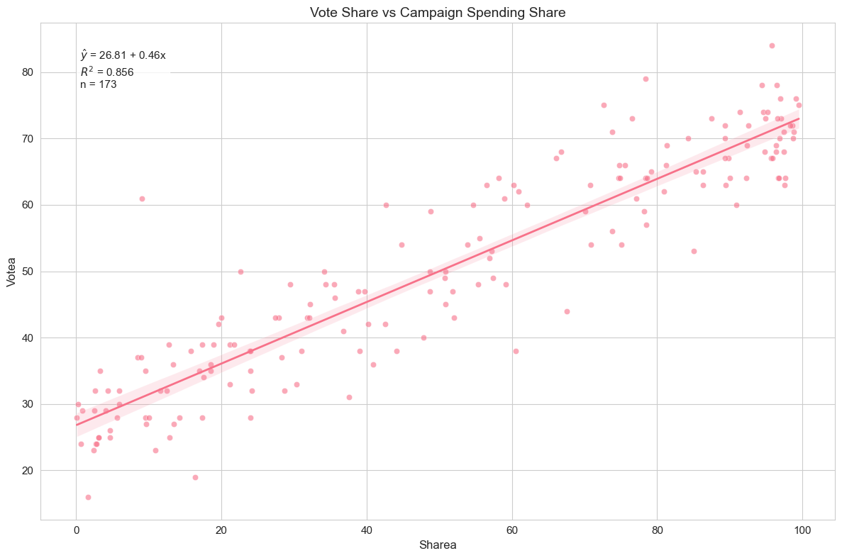
The regression plot demonstrates the strong linear relationship between campaign spending share and vote share, with most data points closely following the fitted line.
2.2. Coefficients, Fitted Values, and Residuals
As we discussed earlier, after estimating the OLS regression, we obtain fitted values () and residuals (). Let’s formally define them again:
Fitted Values: These are the predicted values of for each observation , calculated using the estimated regression equation:
Fitted values lie on the OLS regression line. For each , is the point on the line directly above or below .
Residuals: These are the differences between the actual values of and the fitted values . They represent the unexplained part of for each observation:
Residuals are estimates of the unobservable error terms . In OLS regression, we aim to minimize the sum of squared residuals.
Important Properties of OLS Residuals:
Zero mean: (always true by construction)
Orthogonality: (residuals are uncorrelated with regressors)
Regression line passes through mean: The point always lies on the fitted regression line
Example 2.6: CEO Salary and Return on Equity
Let’s go back to the CEO salary and ROE example and examine the fitted values and residuals. We will calculate these and present the first 15 observations in a table. We will also create a residual plot to visualize the residuals.
# Prepare regression results - Re-run the regression for ceosal1 dataset
ceosal1 = wool.data("ceosal1")  # Load data again (if needed)
reg = smf.ols(formula="salary ~ roe", data=ceosal1)  # Define the regression model
results = reg.fit()  # Fit the model

# Calculate fitted values and residuals
salary_hat = results.fittedvalues  # Get fitted values from results object
u_hat = results.resid  # Get residuals from results object

# Create summary table
table = pd.DataFrame(  # Create a Pandas DataFrame
    {
        "ROE": ceosal1["roe"],  # Include ROE values
        "Actual Salary": ceosal1["salary"],  # Include actual salary values
        "Predicted Salary": salary_hat,  # Include fitted salary values
        "Residual": u_hat,  # Include residual values
    },
)

# Format and display the first 15 rows
pd.set_option(
    "display.float_format",
    lambda x: "%.2f" % x,
)  # Set float format for display
table.head(15) # Display the first 15 rows of the tableThis code calculates the fitted values and residuals, then creates and displays a summary table showing ROE, actual salary, predicted salary, and residuals for the first 15 observations.
Interpretation of Example 2.6
By examining the table, you can see for each company the actual CEO salary, the salary predicted by the regression model based on ROE, and the residual, which is the difference between the actual and predicted salary. A positive residual means the actual salary is higher than predicted, and a negative residual means it’s lower.
# Create residual plot with seaborn defaults
fig, ax = plt.subplots(figsize=(10, 6))

# Simple, clean scatter plot
sns.scatterplot(x=salary_hat, y=u_hat, ax=ax)

# Add reference line
ax.axhline(y=0, linestyle="--", label="Zero Line")

# Clean titles and labels
ax.set_title("Residual Plot")
ax.set_xlabel("Fitted Values")
ax.set_ylabel("Residuals")
ax.legend()

plt.tight_layout()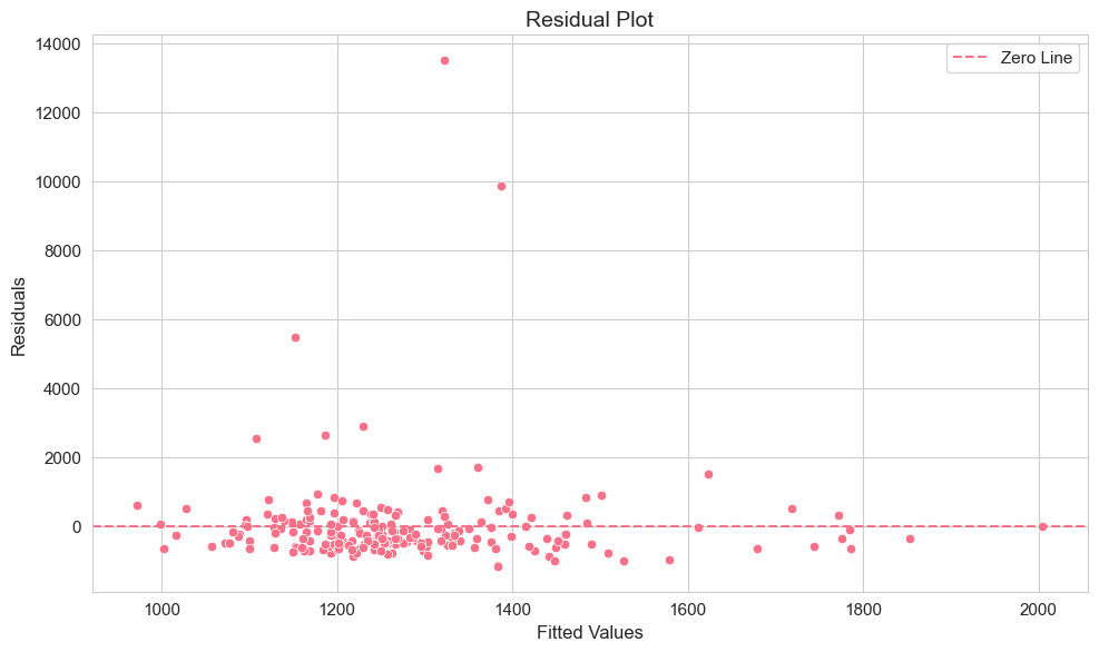
The residual plot is useful for checking assumptions of OLS regression, particularly homoscedasticity (constant variance of errors). Ideally, residuals should be randomly scattered around zero with no systematic pattern. Look for patterns where the spread of residuals changes with fitted values, which could indicate heteroscedasticity.
Example 2.7: Wage and Education
Let’s verify some important properties of OLS residuals using the wage and education example. These properties are mathematical consequences of the OLS minimization process:
The sum of residuals is zero: . This implies that the mean of residuals is also zero: .
The sample covariance between regressors and residuals is zero: . This means that the residuals are uncorrelated with the independent variable .
The point lies on the regression line: This is ensured by the formula for .
Let’s check these properties using the wage1 dataset.
# Load and prepare data - Re-run the regression for wage1 dataset
wage1 = wool.data("wage1")  # Load wage1 data
reg = smf.ols(formula="wage ~ educ", data=wage1)  # Define regression model
results = reg.fit()  # Fit the model

# Get coefficients, fitted values and residuals
b = results.params  # Extract coefficients
wage_hat = results.fittedvalues  # Extract fitted values
u_hat = results.resid  # Extract residuals

# Property 1: Mean of residuals should be zero
u_hat_mean = np.mean(u_hat)  # Calculate the mean of residuals

# Property 2: Covariance between education and residuals should be zero
educ_u_cov = np.cov(wage1["educ"], u_hat)[
    1,
    0,
]  # Calculate covariance between educ and residuals

# Property 3: Point (x_mean, y_mean) lies on regression line
educ_mean = np.mean(wage1["educ"])  # Calculate mean of education
wage_mean = np.mean(wage1["wage"])  # Calculate mean of wage
wage_pred = (
    b.iloc[0] + b.iloc[1] * educ_mean
)  # Predict wage at mean education using regression line

# Display regression properties
properties_data = pd.DataFrame(
    {
        "Property": [
            "Mean of residuals",
            "Covariance between education and residuals",
            "Mean wage",
            "Predicted wage at mean education",
        ],
        "Value": [u_hat_mean, educ_u_cov, wage_mean, wage_pred],
        "Formatted": [
            f"{u_hat_mean:.10f}",
            f"{educ_u_cov:.10f}",
            f"{wage_mean:.6f}",
            f"{wage_pred:.6f}",
        ],
    },
)
properties_data[["Property", "Formatted"]]This code calculates the mean of the residuals, the covariance between education and residuals, and verifies that the predicted wage at the mean level of education is equal to the mean wage.
Interpretation of Example 2.7
The output should show that the mean of residuals is very close to zero (practically zero, given potential floating-point inaccuracies). Similarly, the covariance between education and residuals should be very close to zero. Finally, the predicted wage at the average level of education should be very close to the average wage. These results confirm the mathematical properties of OLS residuals. These properties are not assumptions, but rather outcomes of the OLS estimation procedure.
2.3. Goodness of Fit
After fitting a regression model, it’s important to assess how well the model fits the data. A key measure of goodness of fit in simple linear regression is the R-squared () statistic. R-squared measures the proportion of the total variation in the dependent variable () that is explained by the independent variable () in our model.
To understand R-squared, we first need to define three sums of squares:
Total Sum of Squares (SST): This measures the total sample variation in . It is the sum of squared deviations of from its mean :
where is the sample variance of . SST represents the total variability in the dependent variable that we want to explain.
Explained Sum of Squares (SSE): This measures the variation in predicted by our model. It is the sum of squared deviations of the fitted values from the mean of , :
where is the sample variance of the fitted values. SSE represents the variability in that is explained by our model.
Residual Sum of Squares (SSR): This measures the variation in the residuals , which is the unexplained variation in . It is the sum of squared residuals:
where is the sample variance of residuals. Note that the mean of OLS residuals is always zero (), so we are summing squared deviations from zero. SSR represents the variability in that is not explained by our model.
These three sums of squares are related by the following identity:
This equation states that the total variation in can be decomposed into the variation explained by the model (SSE) and the unexplained variation (SSR).
Now we can define R-squared:
R-squared is the ratio of the explained variation to the total variation. It ranges from 0 to 1 (or 0% to 100%).
means the model explains none of the variation in . In this case, SSE = 0 and SSR = SST.
means the model explains all of the variation in . In this case, SSR = 0 and SSE = SST.
A higher R-squared generally indicates a better fit, but it’s important to remember that a high R-squared does not necessarily mean that the model is good or that there is a causal relationship. R-squared only measures the strength of the linear relationship and the proportion of variance explained.
Example 2.8: CEO Salary and Return on Equity
Let’s calculate and compare R-squared for the CEO salary and ROE example using different formulas. We will also create visualizations to understand the concept of goodness of fit.
# Load and prepare data - Re-run regression for ceosal1
ceosal1 = wool.data("ceosal1")  # Load data
reg = smf.ols(formula="salary ~ roe", data=ceosal1)  # Define regression model
results = reg.fit()  # Fit the model

# Calculate predicted values & residuals
sal_hat = results.fittedvalues  # Get fitted values
u_hat = results.resid  # Get residuals
sal = ceosal1["salary"]  # Get actual salary values

# Calculate $R^2$ in three different ways - Using different formulas for R-squared
R2_a = np.var(sal_hat, ddof=1) / np.var(sal, ddof=1)  # $R^2$ = var(y_hat)/var(y)
R2_b = 1 - np.var(u_hat, ddof=1) / np.var(sal, ddof=1)  # $R^2$ = 1 - var(u_hat)/var(y)
R2_c = np.corrcoef(sal, sal_hat)[1, 0] ** 2  # $R^2$ = correlation(y, y_hat)^2

# Display R-squared calculations
r_squared_data = pd.DataFrame(
    {
        "Method": [
            "Using var($\\hat{y}$)/var(y)",
            "Using 1 - var($\\hat{u}$)/var(y)",
            "Using correlation coefficient",
        ],
        "Formula": [
            "var($\\hat{y}$)/var(y)",
            "1 - var($\\hat{u}$)/var(y)",
            "corr(y, $\\hat{y}$)^2",
        ],
        "R-squared": [R2_a, R2_b, R2_c],
        "Formatted": [f"{R2_a:.4f}", f"{R2_b:.4f}", f"{R2_c:.4f}"],
    },
)
r_squared_data[["Method", "Formatted"]]This code calculates R-squared using three different formulas to demonstrate their equivalence. All three methods should yield the same R-squared value (within rounding errors).
Interpretation of Example 2.8
The R-squared value calculated (around 0.013 in our example) will be the same regardless of which formula is used, confirming their equivalence. This low R-squared indicates that ROE explains very little of the variation in CEO salaries.
# Create model fit visualization with seaborn defaults
fig, axes = plt.subplots(1, 2, figsize=(12, 5))

# Actual vs Predicted plot
sns.scatterplot(x=sal, y=sal_hat, ax=axes[0])
axes[0].plot([sal.min(), sal.max()], [sal.min(), sal.max()], "--", label="Perfect Fit")
axes[0].set_title("Actual vs Predicted Salary")
axes[0].set_xlabel("Actual Salary")
axes[0].set_ylabel("Predicted Salary")
axes[0].legend()

# Residuals vs Fitted plot
sns.scatterplot(x=sal_hat, y=u_hat, ax=axes[1])
axes[1].axhline(y=0, linestyle="--", label="Zero Line")
axes[1].set_title("Residuals vs Fitted Values")
axes[1].set_xlabel("Fitted Values")
axes[1].set_ylabel("Residuals")
axes[1].legend()

plt.tight_layout()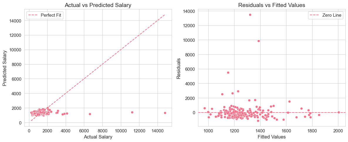
These two plots provide visual assessments of model fit:
Actual vs Predicted Plot: Shows how well predicted salaries align with actual salaries. If the model fit were perfect ( = 1), all points would lie on the 45-degree dashed red line.
Residuals vs Fitted Values Plot: Helps assess homoscedasticity and model adequacy. Ideally, residuals should be randomly scattered around zero with no discernible pattern.
Example 2.9: Voting Outcomes and Campaign Expenditures
Let’s examine the complete regression summary for the voting outcomes and campaign expenditures example, including R-squared and other statistical measures. We will also create an enhanced visualization with a 95% confidence interval.
# Load and analyze voting data - Re-run regression for vote1 dataset
vote1 = wool.data("vote1")  # Load data

# Fit regression model
reg = smf.ols(formula="voteA ~ shareA", data=vote1)  # Define model
results = reg.fit()  # Fit model

# Create a clean summary table - Extract key statistics from results object
summary_stats = pd.DataFrame(  # Create a DataFrame for summary statistics
    {
        "Coefficient": results.params,  # Estimated coefficients
        "Std. Error": results.bse,  # Standard errors of coefficients
        "t-value": results.tvalues,  # t-statistics for coefficients
        "p-value": results.pvalues,  # p-values for coefficients
    },
)

# Display regression summary
summary_metrics = pd.DataFrame(
    {
        "Metric": [
            "R-squared",
            "Adjusted R-squared",
            "F-statistic",
            "Number of observations",
        ],
        "Value": [
            results.rsquared,
            results.rsquared_adj,
            results.fvalue,
            int(results.nobs),
        ],
        "Formatted": [
            f"{results.rsquared:.4f}",
            f"{results.rsquared_adj:.4f}",
            f"{results.fvalue:.2f}",
            f"{int(results.nobs)}",
        ],
    },
)
display(summary_metrics[["Metric", "Formatted"]])

summary_stats.round(4)  # Display summary statistics table, rounded to 4 decimal places

# Create enhanced visualization - Regression plot with confidence interval
plt.figure(figsize=(10, 6))
plot_regression(
    "shareA",
    "voteA",
    vote1,
    results,
    "Vote Share vs Campaign Spending Share\nwith 95% Confidence Interval",  # Title with CI mention
)This code fits the regression model for voting outcomes and campaign spending share. It then creates a summary table containing coefficient estimates, standard errors, t-values, and p-values. It shows this summary, along with R-squared, adjusted R-squared, F-statistic, and the number of observations. Finally, it generates an enhanced regression plot, including a 95% confidence interval, using our plot_regression function.
Interpretation of Example 2.9
The output will provide a comprehensive summary of the regression results. You can see the estimated coefficients for the intercept and shareA, their standard errors, t-values, and p-values. The p-values are used for hypothesis testing (we will discuss this in detail in later chapters). The R-squared and Adjusted R-squared values indicate the goodness of fit. Adjusted R-squared is a modified version of R-squared that adjusts for the number of regressors in the model (it is more relevant in multiple regression). The F-statistic is used for testing the overall significance of the regression model.
The enhanced regression plot visually represents the relationship between shareA and voteA, along with the 95% confidence interval around the regression line, providing a visual sense of the uncertainty in our predictions.
2.4 Nonlinearities
So far, we have focused on linear relationships between variables. However, in many cases, the relationship between the dependent and independent variables might be nonlinear. We can still use linear regression techniques to model certain types of nonlinear relationships by transforming the variables. Common transformations include using logarithms of variables. Let’s consider three common models involving logarithms:
Log-Level Model: In this model, the dependent variable is in logarithm form, while the independent variable is in level form:
In this model, represents the approximate percentage change in for a one-unit change in . Specifically, a one-unit increase in is associated with approximately a percent change in . This approximation is most accurate when is small (typically ). The exact percentage change is percent.
Level-Log Model: Here, the dependent variable is in level form, and the independent variable is in logarithm form:
In this model, represents the approximate change in for a one-percent increase in . Specifically, a one-percent increase in (i.e., from to ) is associated with approximately a change in of units. Equivalently, a 100 percent increase in (i.e., doubling from to ) is associated with a change in of approximately units.
Log-Log Model: In this model, both the dependent and independent variables are in logarithm form:
In the log-log model, is interpreted as the elasticity of with respect to . That is, a one-percent increase in is associated with approximately a percent change in . This interpretation is exact (not an approximation) because , which is the definition of elasticity.
Example 2.10: Wage and Education (Log-Level Model)
Let’s revisit the wage and education example and estimate a log-level model:
In this model, we are interested in the percentage increase in wage for each additional year of education.
# Load and prepare data - Re-use wage1 dataset
wage1 = wool.data("wage1")  # Load data (if needed)

# Estimate log-level model - Define and fit the model with log(wage) as dependent variable
reg = smf.ols(
    formula="np.log(wage) ~ educ",
    data=wage1,
)  # Use np.log() to take logarithm of wage
results = reg.fit()  # Fit the model

# Display Log-Level Model results
log_level_results = pd.DataFrame(
    {
        "Parameter": [
            "Intercept ($\\beta_0$)",
            "Education coefficient ($\\beta_1$)",
            "R-squared",
        ],
        "Value": [results.params.iloc[0], results.params.iloc[1], results.rsquared],
        "Formatted": [
            f"{results.params.iloc[0]:.4f}",
            f"{results.params.iloc[1]:.4f}",
            f"{results.rsquared:.4f}",
        ],
    },
)
log_level_results[["Parameter", "Formatted"]]This code estimates the log-level model using statsmodels with np.log(wage) as the dependent variable and shows the estimated coefficients and R-squared.
Interpretation of Example 2.10
We find . In the log-level model, this coefficient can be interpreted as the approximate percentage change in wage for a one-unit increase in education. So, approximately, each additional year of education is associated with an 8.27% increase in hourly wage. The intercept represents the predicted log(wage) when education is zero. The R-squared value is 0.1858, indicating the proportion of variation in explained by education.
# Create log-level visualization with seaborn defaults
fig, ax = plt.subplots(figsize=(10, 6))

# Simple, elegant regression plot
sns.regplot(
    data=wage1,
    x="educ",
    y=np.log(wage1["wage"]),
    ax=ax,
)

# Clean titles and labels
ax.set_title("Log-Level Model: Log(Wage) vs Years of Education")
ax.set_xlabel("Years of Education")
ax.set_ylabel("Log(Hourly Wage)")

plt.tight_layout()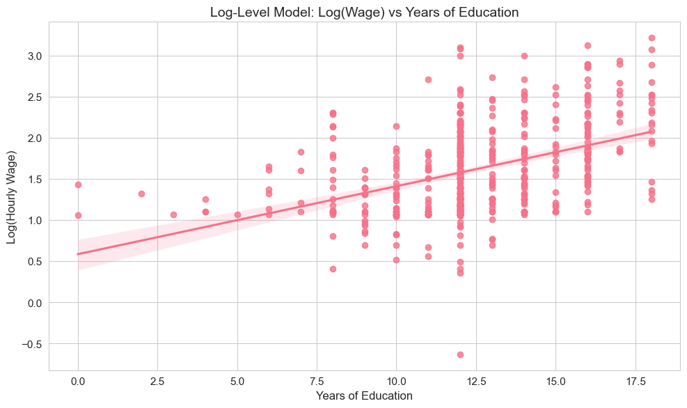
The scatter plot visualizes the log-level relationship, showing how log(wage) varies with years of education, along with the fitted regression line.
Example 2.11: CEO Salary and Firm Sales (Log-Log Model)
Let’s consider the CEO salary and firm sales relationship and estimate a log-log model:
In this model, represents the elasticity of CEO salary with respect to firm sales.
# Load and prepare data - Re-use ceosal1 dataset
ceosal1 = wool.data("ceosal1")  # Load data (if needed)

# Estimate log-log model - Define and fit model with log(salary) and log(sales)
reg = smf.ols(
    formula="np.log(salary) ~ np.log(sales)",
    data=ceosal1,
)  # Use np.log() for both salary and sales
results = reg.fit()  # Fit the model

# Display Log-Log Model results
log_log_results = pd.DataFrame(
    {
        "Parameter": [
            "Intercept ($\\beta_0$)",
            "Sales elasticity ($\\beta_1$)",
            "R-squared",
        ],
        "Value": [results.params.iloc[0], results.params.iloc[1], results.rsquared],
        "Formatted": [
            f"{results.params.iloc[0]:.4f}",
            f"{results.params.iloc[1]:.4f}",
            f"{results.rsquared:.4f}",
        ],
    },
)
log_log_results[["Parameter", "Formatted"]]This code estimates the log-log model using statsmodels with both variables in logarithmic form and shows the estimated coefficients and R-squared.
Interpretation of Example 2.11
We find . In the log-log model, this coefficient is the elasticity of salary with respect to sales. It means that a 1% increase in firm sales is associated with approximately a 0.2567% increase in CEO salary. The intercept does not have a direct practical interpretation in terms of original variables in this model, but it is needed for the regression equation. The R-squared value is 0.2108, indicating the proportion of variation in explained by .
# Create log-log visualization with seaborn defaults
fig, ax = plt.subplots(figsize=(10, 6))

# Simple, elegant regression plot
sns.regplot(
    data=ceosal1,
    x=np.log(ceosal1["sales"]),
    y=np.log(ceosal1["salary"]),
    ax=ax,
)

# Clean titles and labels
ax.set_title("Log-Log Model: CEO Salary Elasticity")
ax.set_xlabel("Log(Firm Sales)")
ax.set_ylabel("Log(CEO Salary)")

plt.tight_layout()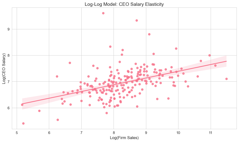
The scatter plot visualizes the log-log relationship between firm sales and CEO salary, demonstrating the elasticity concept where both variables are on logarithmic scales.
2.5. Regression through the Origin and Regression on a Constant
In standard simple linear regression, we include an intercept term (). However, in some cases, it might be appropriate to omit the intercept, forcing the regression line to pass through the origin (0,0). This is called regression through the origin. The model becomes:
In statsmodels, you can perform regression through the origin by including 0 + or - 1 + in the formula, like "salary ~ 0 + roe" or "salary ~ roe - 1".
Another special case is regression on a constant only, where we only estimate the intercept and do not include any independent variable. The model is:
In this case, is simply the sample mean of , . This model essentially predicts the same value () for all observations, regardless of any other factors. In statsmodels, you can specify this as "salary ~ 1" or "salary ~ constant".
Let’s compare these three regression specifications using the CEO salary and ROE example.
# Load and prepare data - Re-use ceosal1 dataset
ceosal1 = wool.data("ceosal1")  # Load data (if needed)

# 1. Regular OLS regression - Regression with intercept
reg1 = smf.ols(formula="salary ~ roe", data=ceosal1)  # Standard regression model
results1 = reg1.fit()  # Fit model 1

# 2. Regression through origin - Regression without intercept
reg2 = smf.ols(
    formula="salary ~ 0 + roe",
    data=ceosal1,
)  # Regression through origin (no intercept)
results2 = reg2.fit()  # Fit model 2

# 3. Regression on constant only - Regression with only intercept (mean model)
reg3 = smf.ols(formula="salary ~ 1", data=ceosal1)  # Regression on constant only
results3 = reg3.fit()  # Fit model 3

# Compare results across all three models
comparison_data = pd.DataFrame(
    {
        "Model": [
            "1. Regular regression",
            "2. Regression through origin",
            "3. Regression on constant",
        ],
        "Intercept ($\\beta_0$)": [
            f"{results1.params.iloc[0]:.2f}",
            "N/A",
            f"{results3.params.iloc[0]:.2f}",
        ],
        "Slope ($\\beta_1$)": [
            f"{results1.params.iloc[1]:.2f}",
            f"{results2.params.iloc[0]:.2f}",
            "N/A",
        ],
        "R-squared": [
            f"{results1.rsquared:.4f}",
            f"{results2.rsquared:.4f}",
            f"{results3.rsquared:.4f}",
        ],
    },
)
comparison_data

# Create regression comparison visualization
fig, ax = plt.subplots(figsize=(12, 8))

# Enhanced scatter plot with seaborn
sns.scatterplot(
    data=ceosal1,
    x="roe",
    y="salary",
    alpha=0.7,
    s=80,
    edgecolors="white",
    linewidths=0.5,
    label="Data Points",
    ax=ax,
)

# Generate smooth x range for regression lines
x_range = np.linspace(ceosal1["roe"].min(), ceosal1["roe"].max(), 100)

# Plot regression lines with distinct, attractive colors
colors = ["#e74c3c", "#27ae60", "#3498db"]  # Red, green, blue
linestyles = ["-", "--", "-."]  # Different line styles
labels = ["Regular Regression", "Through Origin", "Constant Only"]
linewidths = [2.5, 2.5, 2.5]

# Regular regression line
ax.plot(
    x_range,
    results1.params.iloc[0] + results1.params.iloc[1] * x_range,
    color=colors[0],
    linestyle=linestyles[0],
    linewidth=linewidths[0],
    label=labels[0],
    alpha=0.9,
)

# Through origin line
ax.plot(
    x_range,
    results2.params.iloc[0] * x_range,
    color=colors[1],
    linestyle=linestyles[1],
    linewidth=linewidths[1],
    label=labels[1],
    alpha=0.9,
)

# Constant only line (horizontal)
ax.axhline(
    y=results3.params.iloc[0],
    color=colors[2],
    linestyle=linestyles[2],
    linewidth=linewidths[2],
    label=labels[2],
    alpha=0.9,
)

# Enhanced styling
ax.set_title(
    "Comparison of Regression Specifications",
    fontsize=16,
    fontweight="bold",
    pad=20,
)
ax.set_xlabel("Return on Equity (ROE)", fontsize=13, fontweight="bold")
ax.set_ylabel("CEO Salary (thousands $)", fontsize=13, fontweight="bold")

# Enhanced legend
ax.legend(
    loc="upper right",
    frameon=True,
    fancybox=True,
    shadow=True,
    fontsize=11,
)

# Enhanced grid
ax.grid(True, alpha=0.3, linestyle="-", linewidth=0.5)
ax.set_axisbelow(True)

plt.tight_layout()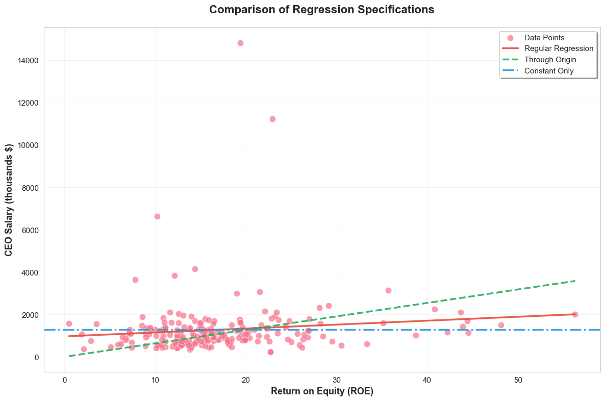
This visualization compares three different regression specifications with distinct styling for each model type.
Interpretation of Example 2.12
By comparing the results, you can see how the estimated coefficients and R-squared values differ across these specifications. Regression through the origin forces the line to go through (0,0), which may or may not be appropriate depending on the context. Regression on a constant simply gives you the mean of the dependent variable as the prediction and will always have an R-squared of 0 (unless variance of y is also zero, which is trivial case).
In the visualization, you can visually compare the fit of these different regression lines to the data. Notice that R-squared for regression through the origin can sometimes be higher or lower than regular OLS, and it should be interpreted cautiously as the total sum of squares is calculated differently in regression through the origin. Regression on a constant will be a horizontal line at the mean of salary.
2.6. Expected Values, Variances, and Standard Errors
To understand the statistical properties of OLS estimators, we need to make certain assumptions about the population regression model and the data. These are known as the Classical Linear Model (CLM) assumptions for simple linear regression. The first five are often called SLR assumptions.
Here are the five key assumptions for Simple Linear Regression:
SLR.1: Linear Population Regression Function: The relationship between and in the population is linear:
This assumes that the model is correctly specified in terms of linearity. This is a maintained assumption throughout the analysis.
SLR.2: Random Sampling: We have a random sample of size , , from the population model. This assumption ensures that our sample is representative of the population we want to study and that observations are independent across .
SLR.3: Sample Variation in x: There is sample variation in the independent variable , i.e., , meaning not all values are identical. If there is no variation in , we cannot estimate the relationship between and (the slope is not identified).
SLR.4: Zero Conditional Mean: The error term has an expected value of zero given any value of :
This is the most crucial assumption for unbiasedness of OLS. It implies that the unobserved factors represented by are, on average, unrelated to at all values of . This assumption implies and . If and are correlated, OLS estimators will be biased and inconsistent.
SLR.5: Homoscedasticity: The error term has the same variance given any value of :
This assumption means that the spread of the errors is constant across all values of . This assumption is required for efficiency (BLUE property) and for the standard formulas for OLS standard errors to be valid. If this assumption is violated (heteroscedasticity), OLS estimators remain unbiased and consistent under SLR.1-SLR.4, but they are no longer the Best Linear Unbiased Estimators (BLUE), and the usual standard errors and test statistics will be incorrect.
Under these assumptions, we have important theoretical results about the OLS estimators:
Theorem 2.1: Unbiasedness of OLS Estimators: Under assumptions SLR.1-SLR.4 (linearity, random sampling, sample variation, and zero conditional mean), the OLS estimators and are unbiased estimators of and , respectively. That is,
Unbiasedness means that on average, across many random samples from the same population, the OLS estimates will equal the true population parameters. Note that SLR.5 (homoscedasticity) is not required for unbiasedness.
Theorem 2.2: Variances of OLS Estimators: Under assumptions SLR.1-SLR.5 (including homoscedasticity), the variances of the OLS estimators conditional on the sample values of are given by:
where is the total sum of squares for , and is the (constant) conditional variance of the error term. These formulas show that the variance of decreases as the sample size increases and as the variation in (measured by ) increases.
To make these variance formulas practically useful, we need to estimate the error variance . An unbiased estimator of is the standard error of regression (SER), denoted as :
The denominator reflects the degrees of freedom, as we lose two degrees of freedom when estimating and . Notice that , which is a slight adjustment to the sample variance of residuals to get an unbiased estimator of .
Using , we can estimate the standard errors of and :
Standard errors measure the precision of our coefficient estimates. Smaller standard errors indicate more precise estimates. They are crucial for hypothesis testing and constructing confidence intervals (which we will cover in subsequent chapters).
Example 2.12: Student Math Performance and the School Lunch Program
Let’s consider an example using the meap93 dataset, examining the relationship between student math performance and the percentage of students eligible for the school lunch program. The model is:
where math10 is the percentage of students passing a math test, and lnchprg is the percentage of students eligible for the lunch program. We expect a negative relationship, i.e., , as higher lunch program participation (indicating more poverty) might be associated with lower math scores.
# Load and analyze data - Use meap93 dataset
meap93 = wool.data("meap93")  # Load data

# Estimate model - Regular OLS regression
reg = smf.ols(formula="math10 ~ lnchprg", data=meap93)  # Define model
results = reg.fit()  # Fit model

# Calculate SER manually - Calculate Standard Error of Regression manually
n = results.nobs  # Number of observations
u_hat_var = np.var(results.resid, ddof=1)  # Sample variance of residuals
SER = np.sqrt(u_hat_var * (n - 1) / (n - 2))  # Calculate SER using formula

# Calculate standard errors manually - Calculate standard errors of beta_0 and beta_1 manually
lnchprg_var = np.var(meap93["lnchprg"], ddof=1)  # Sample variance of lnchprg
lnchprg_mean = np.mean(meap93["lnchprg"])  # Mean of lnchprg
lnchprg_sq_mean = np.mean(meap93["lnchprg"] ** 2)  # Mean of squared lnchprg

se_b1 = SER / (np.sqrt(lnchprg_var) * np.sqrt(n - 1))  # Standard error of beta_1
se_b0 = se_b1 * np.sqrt(lnchprg_sq_mean)  # Standard error of beta_0

# Display manual calculations
manual_calculations = pd.DataFrame(
    {
        "Statistic": ["SER", "SE($\\beta_0$)", "SE($\\beta_1$)"],
        "Manual Calculation": [SER, se_b0, se_b1],
        "Formatted": [f"{SER:.4f}", f"{se_b0:.4f}", f"{se_b1:.4f}"],
    },
)
display(manual_calculations[["Statistic", "Formatted"]])

results.summary().tables[1]  # Display statsmodels summary table

# Create visualization with confidence intervals - Regression plot with CI
plt.figure(figsize=(10, 6))
plot_regression(
    "lnchprg",
    "math10",
    meap93,
    results,
    "Math Scores vs Lunch Program Participation\nwith 95% Confidence Interval",  # Title with CI mention
)This code estimates the regression model, calculates the SER and standard errors of coefficients manually using the formulas, and then shows these manual calculations. It also displays the statsmodels regression summary table, which includes the standard errors calculated by statsmodels (which should match our manual calculations). Finally, it generates a regression plot with a 95% confidence interval.
Interpretation of Example 2.12 (Standard Errors)
By comparing the manually calculated SER and standard errors with those reported in the statsmodels summary table, you can verify that they are consistent. The standard errors provide a measure of the uncertainty associated with our coefficient estimates. Smaller standard errors mean our estimates are more precise. The regression plot with confidence intervals visually shows the range of plausible regression lines, given the uncertainty in our estimates.
2.7. Causal Inference and Limitations
While simple regression is powerful for describing relationships between variables, we must be careful when making causal interpretations. The slope coefficient tells us the association between and , but correlation does not imply causation. To interpret as a causal effect requires strong assumptions that often don’t hold with observational data.
2.7.1. The Ceteris Paribus Interpretation
The regression coefficient represents the change in associated with a one-unit change in , holding all other factors constant (ceteris paribus). However, in reality, when changes, other factors may also change, confounding our ability to isolate the true effect of on .
For example, in our wage-education regression:
More education (higher ) is associated with higher wages (higher )
But education is correlated with ability, family background, motivation, etc.
These omitted factors affect both education and wages
# Illustrate the omitted variable problem
np.random.seed(42)
n = 1000

# Generate data with an omitted variable (ability)
ability = stats.norm.rvs(0, 1, size=n)  # Unmeasured ability
education = 12 + 2 * ability + stats.norm.rvs(0, 2, size=n)  # Ability affects education
wage = 5 + 1.5 * education + 3 * ability + stats.norm.rvs(0, 5, size=n)  # Ability affects wages

# Create DataFrame
df_omitted = pd.DataFrame({"wage": wage, "education": education, "ability": ability})

# Regression WITHOUT controlling for ability (omitted variable bias)
model_biased = smf.ols("wage ~ education", data=df_omitted).fit()

# Regression WITH controlling for ability (closer to true effect)
model_unbiased = smf.ols("wage ~ education + ability", data=df_omitted).fit()

# Compare results
comparison = pd.DataFrame(
    {
        "Model": ["Without Ability (Biased)", "With Ability (Unbiased)", "True Value"],
        "Education Coefficient": [
            model_biased.params["education"],
            model_unbiased.params["education"],
            1.5,
        ],
        "Interpretation": [
            "Overestimates effect (includes ability)",
            "Closer to true causal effect",
            "True causal effect of education",
        ],
    }
)

display(comparison.round(3))

# Visualize the bias
fig, (ax1, ax2) = plt.subplots(1, 2, figsize=(12, 5))

# Biased regression (omitting ability)
ax1.scatter(education, wage, alpha=0.3, s=20)
ax1.plot(
    education,
    model_biased.predict(),
    "r-",
    linewidth=2,
    label=f"Slope = {model_biased.params['education']:.2f}",
)
ax1.set_xlabel("Education (years)")
ax1.set_ylabel("Wage")
ax1.set_title("Omitted Variable Bias\n(Ability not controlled)")
ax1.legend()

# Color by ability to show the confounding
scatter = ax2.scatter(education, wage, c=ability, cmap="viridis", alpha=0.5, s=20)
ax2.plot(
    education,
    model_biased.predict(),
    "r--",
    linewidth=2,
    label=f"Biased: {model_biased.params['education']:.2f}",
)
# Note: For true line, we'd need to fix ability at its mean
ax2.set_xlabel("Education (years)")
ax2.set_ylabel("Wage")
ax2.set_title("Wage colored by Ability\n(showing confounding)")
ax2.legend()
plt.colorbar(scatter, ax=ax2, label="Ability")

plt.tight_layout()Key Limitation
Omitted variable bias occurs when a variable that affects both and is left out of the regression. This causes the estimated coefficient to capture not just the effect of , but also the indirect effect through the omitted variable. Multiple regression (Chapter 3) helps address this by including additional control variables, but we can never be sure we’ve controlled for everything.
2.7.2. Requirements for Causal Interpretation
For to represent a causal effect of on , we need:
Exogeneity: - The error term must be uncorrelated with
All other factors affecting must be independent of
Difficult to achieve with observational data
No reverse causality: causes , not the other way around
Example: Does income cause health, or does health cause income?
No measurement error: Both and are measured accurately
Measurement error in causes attenuation bias
Correct functional form: The linear model is appropriate
Relationship may be nonlinear in reality
These conditions are rarely satisfied with observational data, which is why economists often seek natural experiments or use more advanced techniques (instrumental variables, difference-in-differences, regression discontinuity) to credibly estimate causal effects.
2.8. Potential Outcomes and Randomized Experiments
Modern causal inference uses the potential outcomes framework, which provides a rigorous way to think about causality and connects directly to regression analysis.
2.8.1. The Potential Outcomes Framework
Suppose we want to estimate the effect of a treatment (e.g., job training program) on an outcome (e.g., earnings). Each individual has two potential outcomes:
: Outcome if individual receives treatment ()
: Outcome if individual does not receive treatment ()
The individual treatment effect is:
The fundamental problem: We can only observe ONE of these potential outcomes for each person!
If person receives treatment, we observe but not
If person doesn’t receive treatment, we observe but not
We can, however, estimate the Average Treatment Effect (ATE):
2.8.2. Randomized Controlled Trials (RCTs)
Randomization solves the fundamental problem by ensuring that treatment and control groups are comparable on average:
With randomization, the ATE can be estimated by comparing average outcomes:
Connection to regression: When is binary (0/1), the regression coefficient equals the ATE!
# Simulate a randomized controlled trial
np.random.seed(123)
n = 500

# Generate potential outcomes (both exist for everyone, but we only observe one)
y0 = 50 + stats.norm.rvs(0, 10, size=n)  # Potential outcome without treatment
treatment_effect = 15  # True ATE
y1 = y0 + treatment_effect  # Potential outcome with treatment

# RANDOM assignment to treatment
treatment = stats.bernoulli.rvs(0.5, size=n)  # 50% get treatment

# Observed outcome (fundamental problem: we only see one potential outcome)
y_observed = treatment * y1 + (1 - treatment) * y0

# Create DataFrame
rct_data = pd.DataFrame(
    {
        "outcome": y_observed,
        "treatment": treatment,
        "y0": y0,  # Normally unobserved!
        "y1": y1,  # Normally unobserved!
    }
)

# Method 1: Difference in means (simple comparison)
ate_diff_means = rct_data[rct_data["treatment"] == 1]["outcome"].mean() - rct_data[
    rct_data["treatment"] == 0
]["outcome"].mean()

# Method 2: Regression (equivalent with binary treatment!)
model_rct = smf.ols("outcome ~ treatment", data=rct_data).fit()
ate_regression = model_rct.params["treatment"]

# Display results
ate_results = pd.DataFrame(
    {
        "Method": [
            "True ATE",
            "Difference in Means",
            "Regression Coefficient",
            "Standard Error (Regression)",
        ],
        "Estimate": [
            treatment_effect,
            ate_diff_means,
            ate_regression,
            model_rct.bse["treatment"],
        ],
        "95% CI": [
            "N/A",
            "N/A",
            f"[{model_rct.conf_int().loc['treatment', 0]:.2f}, {model_rct.conf_int().loc['treatment', 1]:.2f}]",
            "N/A",
        ],
    }
)

display(ate_results.round(3))

# Visualize the RCT results: Box plot comparing treatment and control
fig, ax = plt.subplots(figsize=(10, 6))

rct_data.boxplot(column="outcome", by="treatment", ax=ax)
ax.set_xlabel("Treatment Status")
ax.set_ylabel("Outcome")
ax.set_title("RCT: Treatment vs Control\n(Randomization ensures comparability)")
ax.set_xticklabels(["Control", "Treatment"])
plt.sca(ax)
plt.xticks([1, 2], ["Control (x=0)", "Treatment (x=1)"])
plt.tight_layout()

# Regression visualization
plot_regression(
    "treatment",
    "outcome",
    rct_data,
    model_rct,
    "Regression with Binary Treatment\n(Slope = Average Treatment Effect)",
)

plt.tight_layout()Key Insights
With randomization, the regression coefficient on a binary treatment variable equals the ATE
Randomization makes treatment assignment independent of potential outcomes:
This is why RCTs are the “gold standard” for causal inference
Without randomization (observational data), selection bias can occur if treatment is correlated with potential outcomes
2.8.3. Limitations and Extensions
Even with RCTs, challenges remain:
External validity: Results may not generalize beyond the study population
Compliance: Not everyone assigned to treatment actually receives it
Attrition: People drop out of the study
Spillovers: Treatment of some affects outcomes of others
When RCTs are not feasible, econometricians use quasi-experimental methods:
Instrumental variables (Chapter 15)
Difference-in-differences
Regression discontinuity
Matching methods
These methods attempt to mimic randomization using observational data, but require strong assumptions.
2.9 Monte Carlo Simulations
Monte Carlo simulations are powerful tools for understanding the statistical properties of estimators, like the OLS estimators. They involve repeatedly generating random samples from a known population model, estimating the parameters using OLS in each sample, and then examining the distribution of these estimates. This helps us to empirically verify properties like unbiasedness and understand the sampling variability of estimators.
2.9.1. One Sample
Let’s start by simulating a single sample from a population regression model. We will define a true population model, generate random data based on this model, estimate the model using OLS on this sample, and compare the estimated coefficients with the true population parameters.
# Set random seed for reproducibility - Ensure consistent random number generation
np.random.seed(1234567)  # Set seed for random number generator

# Set parameters - Define true population parameters and sample size
n = 1000  # sample size
beta0 = 1  # true intercept
beta1 = 0.5  # true slope
sigma_u = 2  # standard deviation of error term

# Generate data - Simulate x, u, and y based on population model
x = stats.norm.rvs(4, 1, size=n)  # x ~ N(4, 1) - Generate x from normal distribution
u = stats.norm.rvs(
    0,
    sigma_u,
    size=n,
)  # u ~ N(0, 4) - Generate error term from normal distribution
y = (
    beta0 + beta1 * x + u
)  # population regression function - Generate y based on true model
df = pd.DataFrame({"y": y, "x": x})  # Create DataFrame

# Estimate model - Perform OLS regression on simulated data
reg = smf.ols(formula="y ~ x", data=df)  # Define OLS model
results = reg.fit()  # Fit model

# Display true vs estimated parameters
parameter_comparison = pd.DataFrame(
    {
        "Parameter": ["Intercept ($\\beta_0$)", "Slope ($\\beta_1$)", "R-squared"],
        "True Value": [beta0, beta1, "N/A"],
        "Estimated Value": [
            results.params.iloc[0],
            results.params.iloc[1],
            results.rsquared,
        ],
        "Comparison": [
            f"{beta0:.4f} vs {results.params.iloc[0]:.4f}",
            f"{beta1:.4f} vs {results.params.iloc[1]:.4f}",
            f"{results.rsquared:.4f}",
        ],
    },
)
parameter_comparison[["Parameter", "Comparison"]]

# Create Monte Carlo visualization with seaborn defaults
fig, axes = plt.subplots(1, 2, figsize=(12, 5))

# Data and regression lines plot
sns.scatterplot(x=x, y=y, ax=axes[0])
x_range = np.linspace(x.min(), x.max(), 100)
axes[0].plot(x_range, beta0 + beta1 * x_range, label="True Population Line")
axes[0].plot(
    x_range,
    results.params.iloc[0] + results.params.iloc[1] * x_range,
    "--",
    label="Sample Estimate",
)
axes[0].set_title("Simulated Data with Regression Lines")
axes[0].set_xlabel("x")
axes[0].set_ylabel("y")
axes[0].legend()

# Error distribution plot
sns.histplot(u, bins=25, stat="density", ax=axes[1])
u_range = np.linspace(u.min(), u.max(), 100)
axes[1].plot(u_range, stats.norm.pdf(u_range, 0, sigma_u), label="True Distribution")
axes[1].set_title("Error Term Distribution")
axes[1].set_xlabel("Error term (u)")
axes[1].set_ylabel("Density")
axes[1].legend()

plt.tight_layout()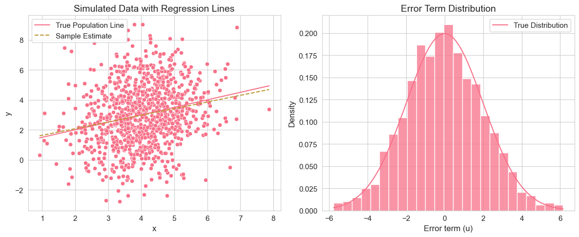
This code simulates a dataset from a simple linear regression model with known parameters. It then estimates the model using OLS and compares the estimated coefficients to the true parameters. It also visualizes the simulated data with both the true population regression line and the estimated regression line, as well as the distribution of the error terms compared to the true error distribution.
Interpretation of Example 2.13.1
By running this code, you will see that the estimated coefficients and are close to, but not exactly equal to, the true values and . This is because we are using a single random sample, and there is sampling variability. The regression plot shows the scatter of data points around the true population regression line, and the estimated regression line is an approximation based on this sample. The error distribution histogram should resemble the true normal distribution of errors.
2.9.2. Many Samples
To better understand the sampling properties of OLS estimators, we need to repeat the simulation process many times. This will allow us to observe the distribution of the OLS estimates across different samples, which is known as the sampling distribution. We can then check if the estimators are unbiased by looking at the mean of these estimates and examine their variability.
# Set parameters - Simulation parameters (number of replications increased)
np.random.seed(1234567)  # Set seed
n = 1000  # sample size
r = 10000  # number of replications (vectorized for efficiency)
beta0 = 1  # true intercept
beta1 = 0.5  # true slope
sigma_u = 2  # standard deviation of error term

# Generate fixed x values - Keep x values constant across replications to isolate variability from error term
x = stats.norm.rvs(4, 1, size=n)  # Fixed x values from normal distribution

# Vectorized Monte Carlo simulation - Generate all error terms at once (r x n matrix)
u = stats.norm.rvs(0, sigma_u, size=(r, n))  # All error terms: r replications x n observations

# Generate all y values at once using broadcasting - Efficient vectorized computation
y = beta0 + beta1 * x + u  # Shape: (r, n) - all samples simultaneously

# Compute OLS coefficients using vectorized formulas - Direct calculation without loops
x_centered = x - x.mean()  # Center x values
y_centered = y - y.mean(axis=1, keepdims=True)  # Center y values (each replication)

# Vectorized OLS formulas applied to all replications at once
b1 = (x_centered * y_centered).sum(axis=1) / (x_centered**2).sum()  # Slope estimates
b0 = y.mean(axis=1) - b1 * x.mean()  # Intercept estimates

# Display Monte Carlo results
monte_carlo_results = pd.DataFrame(
    {
        "Parameter": ["Intercept ($\\beta_0$)", "Slope ($\\beta_1$)"],
        "True Value": [beta0, beta1],
        "Mean Estimate": [np.mean(b0), np.mean(b1)],
        "Standard Deviation": [np.std(b0, ddof=1), np.std(b1, ddof=1)],
        "Summary": [
            f"True: {beta0:.4f}, Mean: {np.mean(b0):.4f}, SD: {np.std(b0, ddof=1):.4f}",
            f"True: {beta1:.4f}, Mean: {np.mean(b1):.4f}, SD: {np.std(b1, ddof=1):.4f}",
        ],
    },
)
monte_carlo_results[["Parameter", "Summary"]]

# Create sampling distribution visualization with seaborn defaults
fig, axes = plt.subplots(1, 2, figsize=(12, 5))

# Beta_0 distribution
sns.histplot(b0, bins=25, stat="density", ax=axes[0])
axes[0].axvline(beta0, linestyle="-", label="True Value")
axes[0].axvline(np.mean(b0), linestyle="--", label="Sample Mean")
axes[0].set_title("Sampling Distribution of $\\beta_0$")
axes[0].set_xlabel("$\\beta_0$ Estimates")
axes[0].legend()

# Beta_1 distribution
sns.histplot(b1, bins=25, stat="density", ax=axes[1])
axes[1].axvline(beta1, linestyle="-", label="True Value")
axes[1].axvline(np.mean(b1), linestyle="--", label="Sample Mean")
axes[1].set_title("Sampling Distribution of $\\beta_1$")
axes[1].set_xlabel("$\\beta_1$ Estimates")
axes[1].legend()

plt.tight_layout()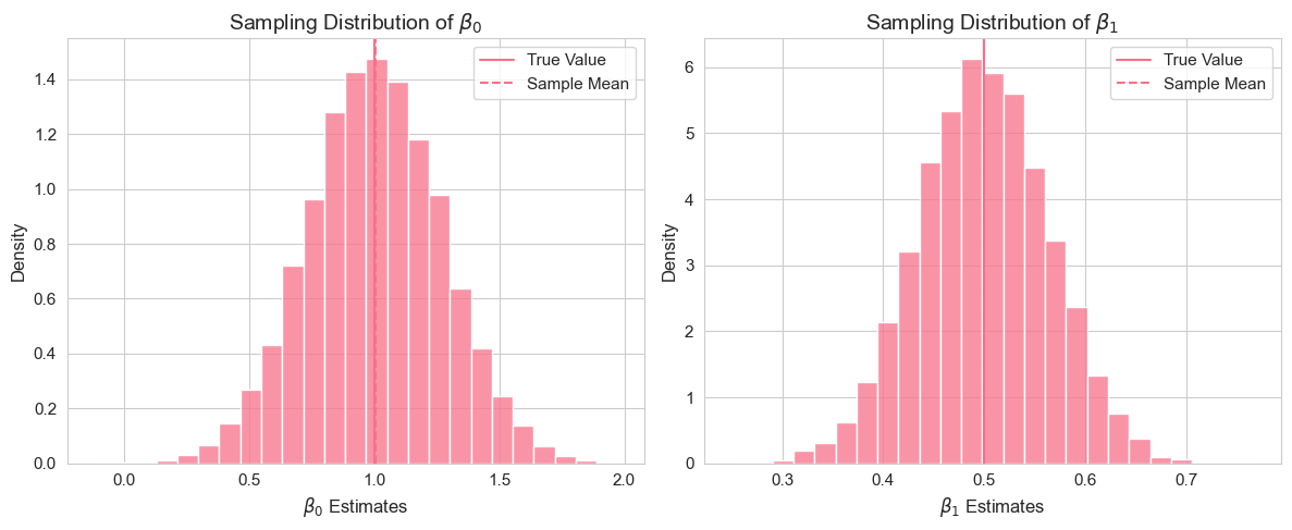
This vectorized code performs a Monte Carlo simulation efficiently with 10,000 replications. Instead of looping through each replication, we generate all error terms at once as an matrix and use broadcasting to compute all values simultaneously. The OLS formulas are then applied directly to the entire matrix using vectorized operations, which is much faster than iterating. After computing all coefficient estimates, we calculate summary statistics and visualize the sampling distributions.
Interpretation of Example 2.13.2
By running this code, you will observe the sampling distributions of and . The histograms should be roughly bell-shaped (approximating normal distributions, due to the Central Limit Theorem). Importantly, you should see that the mean of the estimated coefficients (vertical green dashed line in the histograms) is very close to the true population parameters (vertical red dashed line). This empirically demonstrates the unbiasedness of the OLS estimators under the SLR assumptions. The standard deviations of the estimated coefficients provide a measure of their sampling variability.
2.9.3. Violation of SLR.4 (Zero Conditional Mean)
Now, let’s investigate what happens when one of the key assumptions is violated. Consider the violation of SLR.4, the zero conditional mean assumption, i.e., . This means that the error term is correlated with . In this case, we expect OLS estimators to be biased. Let’s simulate a scenario where this assumption is violated and see the results.
# Set parameters - Simulation parameters (same as before)
np.random.seed(1234567)  # Set seed
n = 1000
r = 10000  # full replications with vectorization
beta0 = 1
beta1 = 0.5
sigma_u = 2

# Generate fixed x values - Fixed x values
x = stats.norm.rvs(4, 1, size=n)

# Vectorized simulation with E(u|x) != 0 - Efficient violation of SLR.4
u_mean = (x - 4) / 5  # E(u|x) = (x - 4)/5 - Conditional mean of error depends on x

# Generate all error terms with non-zero conditional mean using broadcasting
u = stats.norm.rvs(size=(r, n)) * sigma_u + u_mean  # Broadcasting u_mean across r replications

# Generate all y values at once - Vectorized computation
y = beta0 + beta1 * x + u  # Shape: (r, n)

# Compute OLS coefficients using vectorized formulas
x_centered = x - x.mean()
y_centered = y - y.mean(axis=1, keepdims=True)

b1 = (x_centered * y_centered).sum(axis=1) / (x_centered**2).sum()  # Slope estimates
b0 = y.mean(axis=1) - b1 * x.mean()  # Intercept estimates

# Display Monte Carlo results with bias analysis
bias_results = pd.DataFrame(
    {
        "Parameter": ["Intercept ($\\beta_0$)", "Slope ($\\beta_1$)"],
        "True Value": [beta0, beta1],
        "Mean Estimate": [np.mean(b0), np.mean(b1)],
        "Bias": [np.mean(b0) - beta0, np.mean(b1) - beta1],
        "Analysis": [
            f"True: {beta0:.4f}, Estimate: {np.mean(b0):.4f}, Bias: {np.mean(b0) - beta0:.4f}",
            f"True: {beta1:.4f}, Estimate: {np.mean(b1):.4f}, Bias: {np.mean(b1) - beta1:.4f}",
        ],
    },
)
bias_results[["Parameter", "Analysis"]]

# Create bias visualization with seaborn defaults
fig, axes = plt.subplots(1, 2, figsize=(12, 5))

# Beta_0 distribution showing bias
sns.histplot(b0, bins=25, stat="density", ax=axes[0])
axes[0].axvline(beta0, linestyle="-", label="True Value")
axes[0].axvline(np.mean(b0), linestyle="--", label="Biased Mean")
axes[0].set_title("Sampling Distribution of $\\beta_0$\nwith E(u|x) $\\neq$ 0")
axes[0].set_xlabel("$\\beta_0$ Estimates")
axes[0].legend()

# Beta_1 distribution showing bias
sns.histplot(b1, bins=25, stat="density", ax=axes[1])
axes[1].axvline(beta1, linestyle="-", label="True Value")
axes[1].axvline(np.mean(b1), linestyle="--", label="Biased Mean")
axes[1].set_title("Sampling Distribution of $\\beta_1$\nwith E(u|x) $\\neq$ 0")
axes[1].set_xlabel("$\\beta_1$ Estimates")
axes[1].legend()

plt.tight_layout()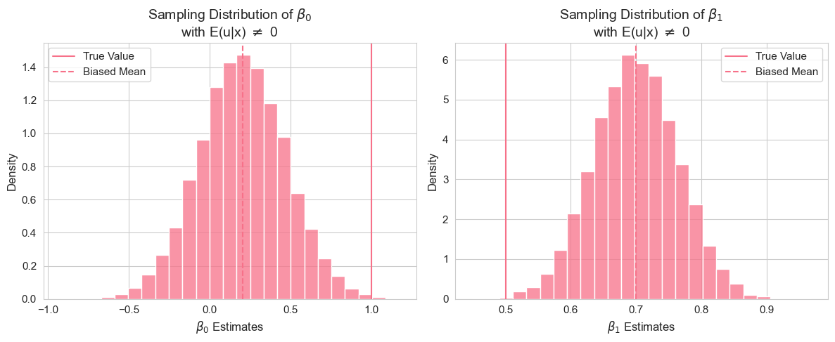
In this vectorized code, we intentionally violate the zero conditional mean assumption by setting the mean of the error term to depend on : . Instead of looping, we use broadcasting to add the conditional mean to all replications at once, then perform the vectorized Monte Carlo simulation.
Interpretation of Example 2.13.3
By running this simulation, you will observe that the mean of the estimated coefficients and are no longer close to the true values and . The bias, calculated as the difference between the mean estimate and the true value, will be noticeably different from zero. This empirically demonstrates that when the zero conditional mean assumption (SLR.4) is violated, the OLS estimators become biased. The histograms of the sampling distributions will be centered around the biased mean estimates, not the true values.
2.9.4. Violation of SLR.5 (Homoscedasticity)
Finally, let’s consider the violation of SLR.5, the homoscedasticity assumption, i.e., . This means that the variance of the error term is not constant across values of (heteroscedasticity). While heteroscedasticity does not cause bias in OLS estimators, it affects their efficiency and the validity of standard errors and inference. Let’s simulate a scenario with heteroscedasticity.
# Set parameters - Simulation parameters (same as before)
np.random.seed(1234567)  # Set seed
n = 1000
r = 10000  # full replications with vectorization
beta0 = 1
beta1 = 0.5

# Generate fixed x values - Fixed x values
x = stats.norm.rvs(4, 1, size=n)

# Vectorized simulation with heteroscedasticity - Efficient violation of SLR.5
u_std = np.sqrt(4 / np.exp(4.5) * np.exp(x))  # var(u|x) = 4e^(x-4.5) -> std(u|x)

# Generate all error terms with variance depending on x using broadcasting
u = stats.norm.rvs(size=(r, n)) * u_std  # Broadcasting u_std across r replications

# Generate all y values at once - Vectorized computation
y = beta0 + beta1 * x + u  # Shape: (r, n)

# Compute OLS coefficients using vectorized formulas
x_centered = x - x.mean()
y_centered = y - y.mean(axis=1, keepdims=True)

b1 = (x_centered * y_centered).sum(axis=1) / (x_centered**2).sum()  # Slope estimates
b0 = y.mean(axis=1) - b1 * x.mean()  # Intercept estimates

# Display Monte Carlo results with heteroscedasticity
heteroscedasticity_results = pd.DataFrame(
    {
        "Parameter": ["Intercept ($\\beta_0$)", "Slope ($\\beta_1$)"],
        "True Value": [beta0, beta1],
        "Mean Estimate": [np.mean(b0), np.mean(b1)],
        "Standard Deviation": [np.std(b0, ddof=1), np.std(b1, ddof=1)],
        "Summary": [
            f"True: {beta0:.4f}, Mean: {np.mean(b0):.4f}, SD: {np.std(b0, ddof=1):.4f}",
            f"True: {beta1:.4f}, Mean: {np.mean(b1):.4f}, SD: {np.std(b1, ddof=1):.4f}",
        ],
    },
)
heteroscedasticity_results[["Parameter", "Summary"]]

# Create heteroscedasticity visualization - Use last replication for visualization
fig, axes = plt.subplots(1, 2, figsize=(12, 5))

# Simple scatter plot with heteroscedasticity - Use last replication
y_last = y[-1]  # Last replication for visualization
u_last = u[-1]  # Last replication errors

sns.scatterplot(x=x, y=y_last, ax=axes[0])
x_range = np.linspace(x.min(), x.max(), 100)
axes[0].plot(x_range, beta0 + beta1 * x_range, "--", label="True Regression Line")
axes[0].set_title("Sample Data with Heteroscedasticity")
axes[0].set_xlabel("x")
axes[0].set_ylabel("y")
axes[0].legend()

# Error term visualization
sns.scatterplot(x=x, y=u_last, ax=axes[1])
axes[1].axhline(y=0, linestyle="--", label="E(u|x) = 0")
axes[1].set_title("Error Terms vs. x")
axes[1].set_xlabel("x")
axes[1].set_ylabel("Error term (u)")
axes[1].legend()

plt.tight_layout()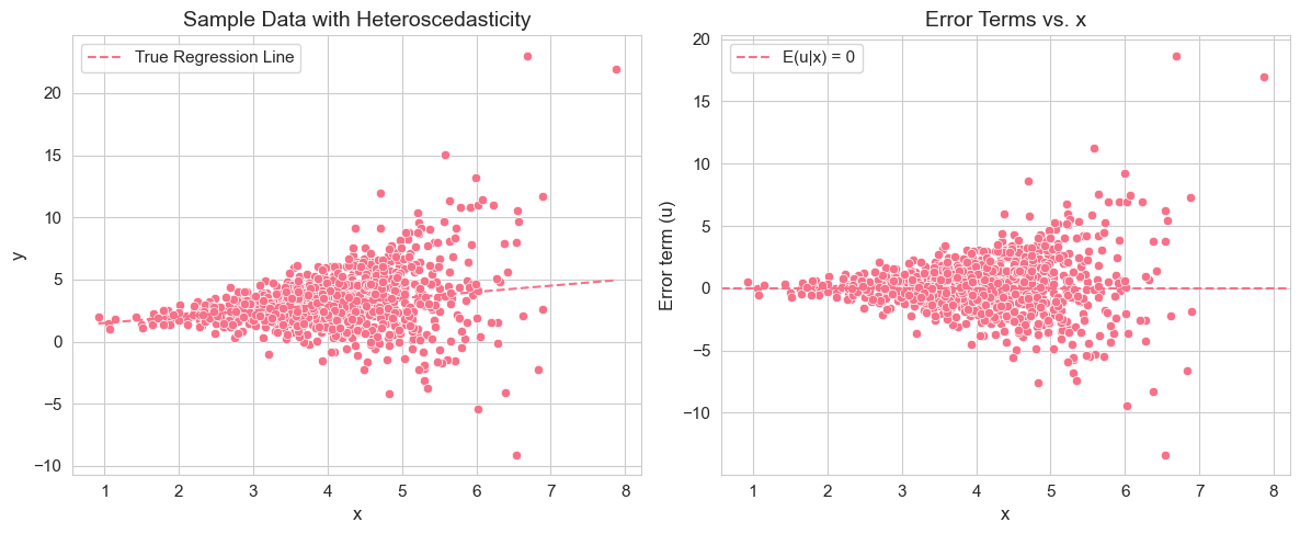
In this vectorized code, we introduce heteroscedasticity by making the variance of the error term dependent on : . We compute the standard deviation and use broadcasting to scale the standard normal error terms across all replications simultaneously, making the simulation much more efficient.
Interpretation of Example 2.13.4
By running this simulation, you will observe that the mean of the estimated coefficients and are still close to the true values and . This confirms that OLS estimators remain unbiased even under heteroscedasticity (as long as SLR.1-SLR.4 hold). However, you might notice that the standard deviations of the estimated coefficients (sampling variability) could be different compared to the homoscedastic case (Example 2.7.2), although unbiasedness is maintained. The scatter plot of data with heteroscedasticity will show that the spread of data points around the regression line is not constant across the range of . The plot of error terms vs. directly visualizes the heteroscedasticity, as you’ll see the spread of error terms changing with .
Through these Monte Carlo simulations, we have empirically explored the properties of OLS estimators and the consequences of violating some of the key assumptions of the simple linear regression model.
This concludes our exploration of the Simple Regression Model. We have covered the basics of OLS estimation, interpretation of results, goodness of fit, nonlinear transformations, special regression cases, and the importance of underlying assumptions. We also used Monte Carlo simulations to understand the statistical properties of OLS estimators. This foundation is crucial for understanding more advanced econometric techniques and models in subsequent chapters.